EHS Answers
What should a people analytics dashboard actually show leaders?
Most dashboards are built to display everything a system can measure. The best ones are built to show only what a leader needs to act on.
No card needed. No setup required. Live in seconds.
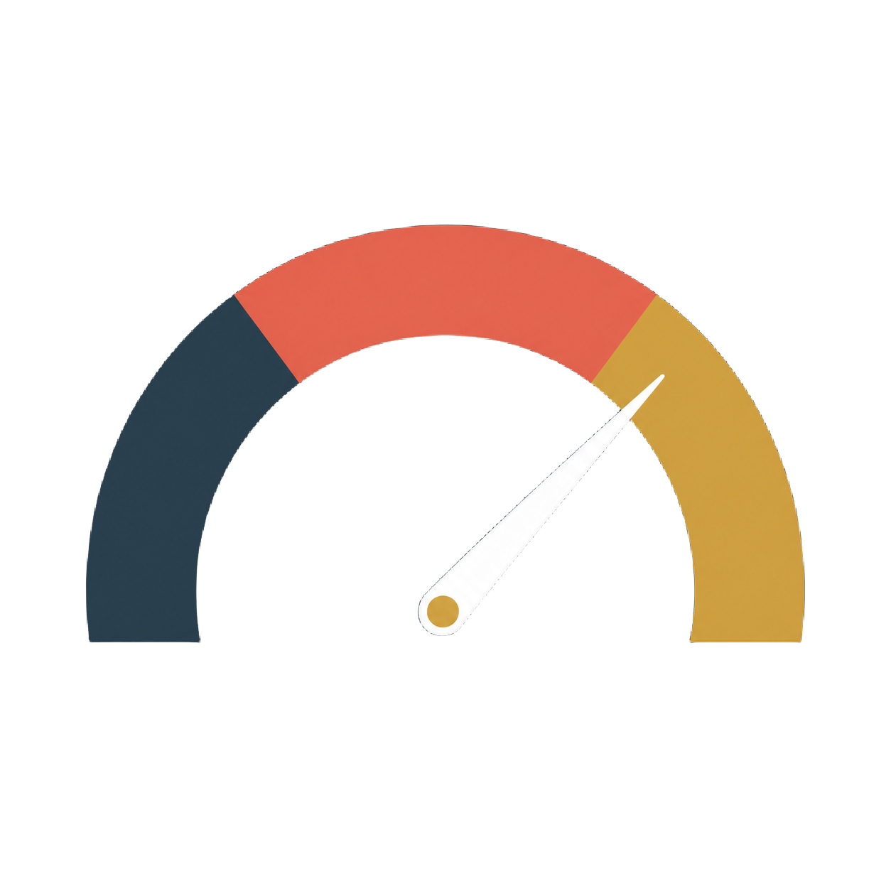
A good people analytics dashboard shows one thing clearly: how people feel right now, and whether that's moving in the right direction. Most dashboards do the opposite. They surface dozens of charts, filters, and breakdowns because the data exists, not because a leader asked for it. The result is a screen that looks thorough and gets checked once a month, if that. A dashboard only earns a place in someone's daily routine if it takes seconds to read and tells them something true.
Two ways to build a dashboard
The data-first dashboard
Built to report everything
- Built around everything the system can measure
- Multiple charts, filters, and breakdowns on one screen
- Needs a walkthrough before anyone can use it properly
- Gets opened occasionally, not daily
- Answers "what data do we have"
The EHS dashboard
Built to be checked daily
- Built around the one number that matters most
- One score, updated continuously
- Readable in the time it takes to glance at a phone
- Checked the way any other business KPI is checked
- Answers "how are people feeling, right now"
Why more charts isn't more clarity
It's tempting to build a dashboard that shows everything, because more data feels like more insight. In practice, the opposite happens. The more a screen tries to show, the harder it becomes to tell what actually matters this week versus what's just background noise. A dashboard leaders actually use has already done that filtering for them.
That's the difference between a dashboard built to report and one built to be checked. EHS is built to be checked, not once a quarter, but the same way you'd glance at any other number that tells you if something needs attention.
What the EHS dashboard actually shows
1
One score
Not a folder of charts. One number, computed continuously from every check-in.
2
Movement, not just a rating
The dashboard shows whether the score is rising, falling, or holding steady, so context is built in rather than left for someone to work out.
3
Detail on demand
Deeper breakdowns are there if you want them. You just don't need them to understand the headline.
Not a Survey. A Speedometer.
Finding out early costs nothing. Finding out late costs everything.